New York Penn Station Terminal Service Plant

NY Penn Station Terminal Service Plant - Exterior

The Penn Station Service Building; A 1908 Structure Survives A ‘Monumental Act of Vandalism’:

The service plant held the key to the railroad’s new operation, for it provided the electric power for the engines in and out of New York. Research by the industrial archaeologist Thomas Flagg indicates that it was also used to supply heat, light, elevator hydraulics and refrigeration for the station as well as compressed air for braking and signaling. It even incinerated the station’s garbage.

The mid-block building, 160 feet long and 86 feet high, is divided by a north-south fire wall with boilers for power generation on the west side and power distribution, offices and other elements on the east.

The station and the service plant were designed by McKim, Mead & White, specifically Charles McKim and partner William Symmes Richardson. Writing in Transactions of the American Society of Civil Engineers for October 1910, Richardson said that, on the station itself, “all unnecessary detail of ornamentation was omitted.”

For the service building the architects assembled some of the simplest elements from the station in the Stony Creek pink granite.
The Roman Doric exterior, a row of severe pilasters bracketing ventilation windows covered with iron grills, is about as plain as a building can get and still have an identifiable style. Cleaned, it could be a post-modern historical society or a crematorium.

NY Penn Station Terminal Service Plant - Interior

NY Penn Station Terminal Service Plant - Control Room

All photos care of the Library of Congress:

New York Penn Station Terminal Service Plant

Michigan Central Station, Detroit

Michigan Central Station

Michigan Central Station (also known as Michigan Central Depot or MCS), built in 1913 for the Michigan Central Railroad, was Detroit, Michigan’s, passenger rail depot from its opening in 1913, when the previous Michigan Central Station burned, until the last Amtrak train pulled away from the station on January 6, 1988.

Michigan Central Station, Detroit
Michigan Central Station, Detroit, originally uploaded by primeau

Farnsworth House becomes even more a part of Nature

20070830-fh_2007_1.jpg
The recent Midwestern rains and
rising floodwaters threaten the Farnsworth House in Plano, IL (which will reopen for tours next month) brought water to just below the elevated floor:

Floodwaters crested on Friday afternoon, August 24, just below the main floor of the house, which was constructed in 1951 on six-foot high piers along the banks of the Fox River. Following torrential rains during the previous week, the staff of Landmarks Illinois–which operates the historic site–implemented an emergency flood plan, raising the house’s furniture on crates and removing other valuable articles. An August 28th
Chicago Tribune article provides more information.

While Pruned calls this design a quasi-failure, I think they protest too much. I do recall from history that the house was lifted on stilts for this very reason; which is quite a Modernist reaction to nature’s wrath.
Outside the Roofless Church
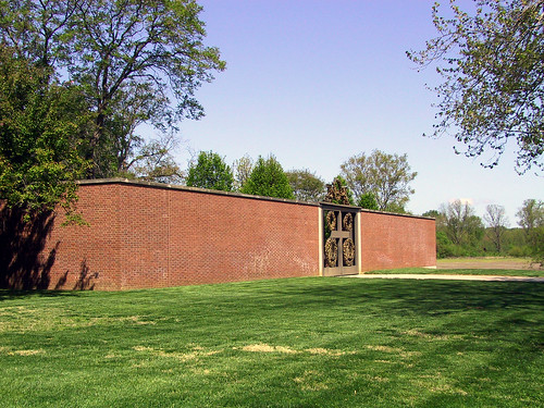
This is similar to Philip Johnson’s Roofless Church in New Harmony, IN (worth a visit) which is sited just out the Wabash River flood plain. The project is surrounded by a masonry wall with only two voids: the entry, on the major axis, and on the secondary axis a void which functions as an alter to contemplate the rising spring and fall floods. Johnson eloquently designs with Nature, and all of her seasons to create a quite nice contemplative space.
http://maps.google.com/maps/ms?ie=UTF8&oe=utf-8&client=firefox-a&hl=en&msa=0&ll=38.13243,-87.935815&spn=0.002063,0.003755&t=k&om=0&msid=110877284097991833184.000438ea64e2040ee08d9&output=embed&s=AARTsJrBXV9VZ_UuYVWPrdbVqXSbEZzqmw
View Larger Map

On Mussolini’s Fascist Rome

Colosseo Quadrato

Colosseo Quadrato, originally uploaded by Daniele Muscetta

Amazing article, The empire’s new clothes, about Mussolini’s twenty year building and renovation spree which remade Rome as much as Napoleon remade Paris.

Il Duce was obsessed with Rome, both as physical city and historical symbol. He wanted his fellow Italians to absorb “Romanita”, or Roman-ness. “Rome is our point of departure and reference,” he said. “We dream of a Roman Italy, that is to say wise, strong, disciplined and imperial.”

He even called his grandiose projects “the war that we prefer”, leading some historians to argue that Italian fascism could have had a peaceful future. They are wrong: to the fascists, a building site was always the antechamber to a battlefield.
Nonetheless, for 20 years, Mussolini could do pretty much what he wanted, using the resources of the state. He began by knocking things down. Demolition was as important as construction and, as a result, Rome today looks nothing like it did in the 1920s. Then, cheap tenements hemmed in many of the great classical monuments until they were all but invisible. Mussolini talked about “liberating” the Roman ruins. “All the monuments [of ancient Rome] will stand in their necessary solitude,” he proclaimed. “Like the great oak, they must be freed from all the darkness that surrounds them.”

What continually frustrates me about these sorts of reviews are the lack of photos and maps. To alleviate this, I created a Google Mashup of Mussolini’s Rome to follow. Or you can view it below:

Interesting that the twenty years of Mussolini’s rule have almost been expunged from thought and history (talk about the giant elephant in the room) yet his legacy in built form will live on. I didn’t even realize that the Via dei Fori Imperiali connecting the Palazzo Venezia to the Colosseum was a recent urban intervention. It is almost as if history has been uprooted from context because the man who begot the interventions has been relegated to the far reaches of memory; as if, in polite company, it is uncouth to speak of his works.

Update May 2012
Mussolini’s modern Rome by travel writer Susan Spano published in 2009 feels very similar to the above FT article:

Stray cats padding through the four ancient temples at Largo Argentina, a square just west of Piazza Venezia, inhabit another frame of Il Duce’s dream: archaeological Rome. The Largo Argentina site was discovered when Mussolini ordered the clearing of what was then a slum as part of a wide-ranging project to facilitate traffic and improve hygiene.

But after visiting the square in 1928, he vowed that new construction would never obscure the truncated columns and scattered capitals of the Republican-era temples. Largo Argentina remains a time-warping, mind-bending place where the modern and ancient worlds collide.

Excavating and opening access to ruins — especially those from the age of Il Duce’s hero Emperor Caesar Augustus — became a Fascist fundamental. Mussolini cared little for the art and architecture of subsequent, decadent periods, resulting in the now-lamented demolition of Baroque churches and whole medieval districts, including the winding lanes on the west side of the Tiber River that took pilgrims to St. Peter’s Basilica. In 1936, these were eradicated to make room for the soullessly broad and straight Via della Conciliazione.

This is the description of the Borgo (Rioni di Roma), a semi-obsession of mine.

Comparison Maps of American Universities

This post appeared in a previous blog and is here for posterity’s sake.

Now this is more like it! Just like the subway systems of the world, presented on the same scale, here is a similar project: Comparison Maps of American Universities by Ayers Saint Gross Architects + Planners.

This is a fantastic collection of urban information. What I would like to see are comparisons by geographic location – for example, looking at the similarities and contrasts between Yale and the University of Cincinnati (UC) shown above; comparisons by date of campus construction; comparisons of context and relative urbanity, etc.

Having had a fair amount of experience at both campuses, it is interesting to look at Yale versus UC. Yale’s present campus dating from 1716, is the direct result of lack of central heat and (most importantly) lack of electrical illumination. The technology of the time fostered long, thin masonry buildings with double-loaded corridors with regular windows to maximize light. Later additions were required to mimic this style for political and taste reasons. Visit Yale today, and you would be hard pressed to pick out contemporary buildings (Art and Architecture excepted) from new.

UC on the other hand, was founded in 1819 but was established at its’ present site in 1870, well after the first arc lamps were available and during the golden age of incandescent invention. However, its’ two growth spurts were post-WWII and in the last 20 years. As a result, you get larger buildings with larger footprints which take advantage of central heat and cooling, electric lighting, and other economies of scale.

These maps, along with Sanborn Maps, are invaluable tools for designers and historians.
By the way: for those New Yorkers out there, here are comparison maps for Bronx Zoo and Rutgers (no Columbia or NYU).

Separated At Birth?

This post appeared in a previous blog and is here for posterity’s sake.

At what point do designers start recycling themselves, or take their iconoclastic style to the breaking point? How do you break out of a style, like Frank Gehry or Richard Meier, when clients come to you for the next Guggenheim or Getty Center? Or conversely, what happens when you become a chameleon flirting with styles from year to year? Philip Johnson quipped that, “After 50 years, you shouldn’t do the same thing,” but there seems to be a fine line between steady refinement and abject oscillation.

Case in point: Pritzker winner Zaha Hadid is world-renowned for her idiocentric style and design sense, and yet there are distinctly similar motif’s in the following projects; first the Centre for Contemporary Arts, Rome begun in 2003 and the Dancing Towers in Dubai, a mixed-use series of three towers combining a hotel, speculative office space, and residential space.

It is superficially easy to say that the Dubai project is merely the Rome project turned 90 degrees. It is hard not to pass judgement on Hadid’s projects from a merely visual standpoint: her projects are so iconoclastic and surface/skin dependant that it makes superficial critique easy.

A New Le Corbusier Church?

30ouro.slide3

photo by Ed Alcock for The New York Times

A Church in France Is Almost a Triumph for Le Corbusier:

MORE than 40 years after he drowned off a remote beach in the south of France, Le Corbusier remains a transcendent force. Even if some blame him for the modern city’s greatest sins, from the steamrolling of historical neighborhoods to a stultifying emphasis on function, he is indisputably the most influential architect of the past century.

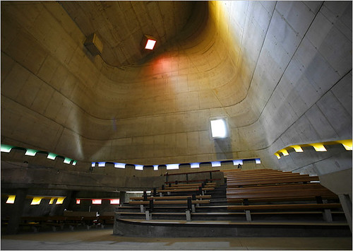
Completed by that protégé, José Oubrerie, who has tinkered with many elements of the original sketches, the Church of St. Pierre has stirred debate among Parisian academics about the ethics of finishing a work left behind by a legendary architect.
But the core of Le Corbusier’s concept remains intact: a sanctuary that distills the history of architecture from the primitive cave through Modernism. At the same time its warped planes anticipate the fluid architectural forms of today, though with a restraint that shows how so much recent work has been diluted by cheap effects.

Very nice, check out the slideshow, and all photos on Flickr and more photos of St Pierre Church, Firminy by Le Corbusier

Freedom Bunker

This post appeared in a previous blog and is here for posterity’s sake.


Freedom Tower, courtesy LMDC
So Larry Silverstein and David Childs (of SOM) have unveiled the newest design for the Freedom Tower, and well, there really isn’t much to say. The best headline so far goes to Curbed, with “Freedom Tower, Now With 34% More Freedom!” But I think, “Freedom Tower, Now With 100% less Libeskind” would be more appropriate.

Here are some stats on the new design:

  1. Tower sits on an “almost impermeable and impregnable” 200-foot concrete and steel pedestal, clad in “ornamental metalwork”
  2. Above that, 69 office floors topped with a restaurant, and two observation decks (at 1362’ and 1368’)
  3. Antenna brings total height to 1,776 feet

Here’s LMDC’s description of the design via their fact sheet: (pdf)

Freedom Tower is a bold and simple icon in the sky that acknowledges the memorial below. While the memorial, carved out of the earth, speaks of the past and of remembrance, Freedom Tower speaks about the future and hope as it rises into the sky in a faceted, crystalline form filled with, and reflecting light. This tall, point tower, in the tradition of great New York City icons such as the Chrysler Building and Empire State Building, evokes the slender, tapering triangular forms of these two great landmarks of midtown and replaces more than one quarter of all the office space that was lost on September 11, 2001.

Snap Critique: Well, it appears that Danny has been pushed right out of the picture – looks like some people will be looking for jobs soon. That little year-plus diversion of pretending that design competitions matter or that master plans matter, sure was fun. Yes, yes – parts of the plan still exist, but it fairly obvious that no one is really paying attention to the master plan.

Could Mr. Childs have made a less graceful building? Are they even trying anymore at SOM? Maybe that separate, locked, floor of architects and interns at SOM really is degredating their design skills. (see update) I doubt the lack of skill at SOM is the primary cause, but the external forces at work bear a majority of the blame for this design.

With all of the innovative and elegant skyscraper design occurring throughout the world, one would think that New York City – cradle of the skyscraper – would advance the genre. Yet the design by Mr. Childs – whether by bureaucratic limitations, safety concerns, lack of client resolve, or lack of design skills – reflects a complete lack of imagination by the design team as whole. It also reflects the lack of imagination or political will of Governor Pataki, who rather than take the time to actually design a truly great building, was (and is) more concerned about photo-op timetables for his 2008 Presidential ambitions.
This design might as well have been the massing studies by Beyer, Blinder, Belle for its lack of grace or substance.

Update
Wow, go Internets. The Hive mind over at Wired New York dredged this up: The new (NEW!!!) Freedom Tower looks nothing at all like the New York Stock Exchange building which was scrapped due to (ba, dum…) September 11th. (via Curbed)

Update on the Update – SOM worker bee emails Curbed to set the record straight that this was an earlier version of NYSE. The final design which was cancelled can seen here.

So this explains how Childs and his worker bees on Wall Street could pump out the design for a 69+ story building in such short notice.
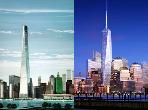
From left: NYSE tower; right, Freedom Tower (courtesy LMDC)

I’m with V-2: it is better to build nothing at this moment in order to preserve the site, than to build something so God-awful that it disgraces the hallowed site. I doubt Pataki et al have the foresight or will to acknowledge this reality.
More photos after the jump:

Continue reading “Freedom Bunker”