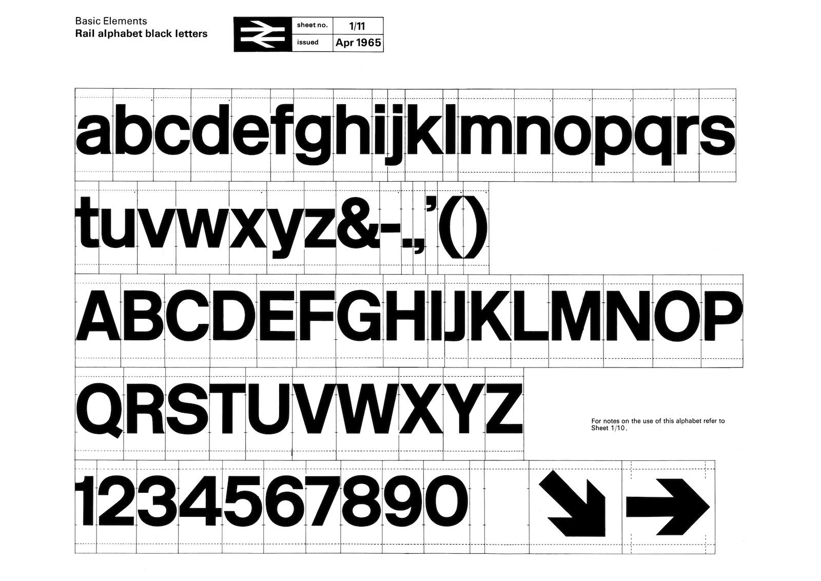
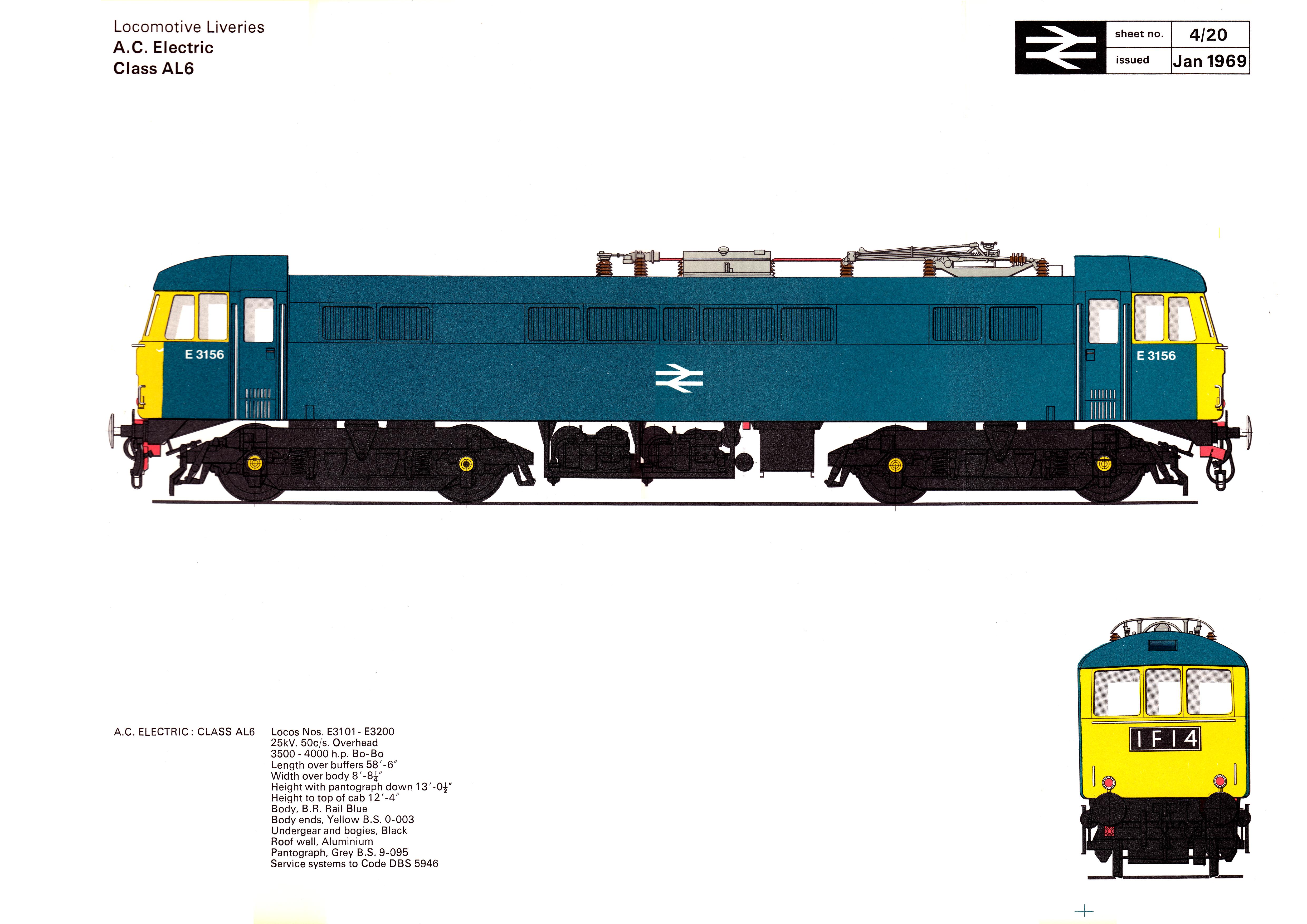
In 1964 the Design Research Unit—Britain’s first multi-disciplinary design agency founded in 1943 by Misha Black, Milner Gray and Herbert Read—was commissioned to breathe new life into the nation’s neglected railway industry, the corporate image of which had remained largely unchanged after its nationalisation in 1948, a reflection of a largely disjointed and out-of-date transport system. The company name was shortened to British Rail and Gerry Barney of the Design Rearch Unit conceived the famous ‘double-arrow’, a remarkably robust and memorable icon that has far outlasted British Rail itself and continues to be used on traffic signs throughout the United Kingdom as the symbol for the national rail network and more specifically railway stations on that network. The new corporate identity programme was launched in January 1965 with an exhibition at the Design Council, London. The corporate identity consisted of four basic elements: the new symbol, the British Rail logotype, the Rail Alphabet typeface and the house colours.


