Harry Beck’s London Underground map is a seminal piece of design, rightly considered the map which all transport diagrams are held to. Recently the Tube Map has become the go-to diagram to remix and reinterpret a whole host of information, with Simon Patterson’s The Great Bear in 1992 kicking off a flurry of remixes shown below.
Where possible, I have included high-resolution versions as an archive. Please note: these are not the actual Tube maps which are available on the Transport for London maps page and they are not reinterpretations of the actual Tube map.
The Great Bear – Simon Patterson, 1992
Tube Music – Dorian Lynskey, 2006
Royal Shakespeare Company – Kit Grover & Hester Lees-Jeffries 2007
Census Dotmap is a map of every person counted by the 2010 US and 2011 Canadian censuses. The map has 341,817,095 dots – one for each person – generated by a Python script from US Census block-level counts, and then generated the tiles with Processing. Here’s more detail for the interested.
Each city is made up of tracts from the 2010 Census. Census tracts are pushed away from neighboring tracts based on the change in proportion of white and black populations between each neighboring tract.
Tracts that have a similar racial mix as their neighbors form groups. Spaces occur where there is a significant change in the racial makeup between neighboring tracts. The space is proportional to the change in racial composition between neighbors (Read More).
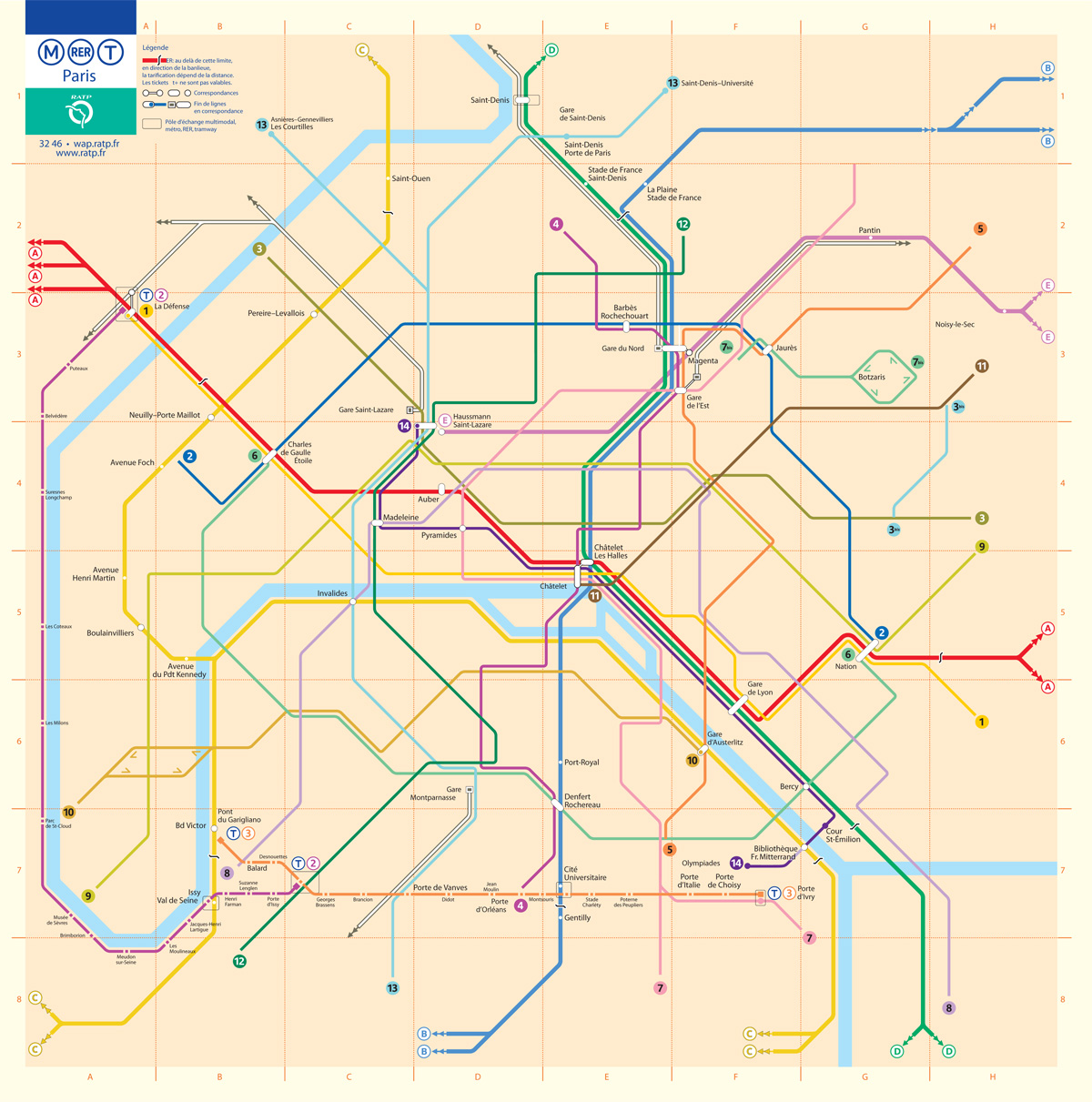
This is the fifth installment of my Accessible Transit Map series. Intended as a replacement map for those with disabilities, this map illustrates which station stops on the Paris Metro are accessible for those with strollers or with a disability. As you can see below, very few stations are accesible in the City of Light:
Opened in 1900, network’s sixteen lines are mostly underground and run to 214 km (133 mi) in length with 301 stations, of which 62 are interchange stations. Just 50 Metro/RER stations within central Paris have elevators and are accessible for wheelchairs or for strollers. Just like London’s Underground the Metro was largely built when accessibility wasn’t a concern; unfortunately the RATP doesn’t match Transport for London’s excellent Accessibility guidelines, offering only a page of platitudes:
Accessibility for persons with reduced mobility. It is the RATP’s ambition to provide every traveller with a transport system suited to his needs from end to end.
As in previous maps, I have removed all stations which are not handicapped accessible. Maps represent corporeal objects, through convenient fictions – a representation which works for a majority of its users. But where are the maps for the disabled or those require additional accessibility? Wouldn’t the mother with newborn in stroller need a different map then those without the need to lug all the accoutrement’s of childhood? Equally, those in a wheelchair require a map different then one which the walking can use. I decided to rectify the situation by editing the maps of major metropolitan transportation systems, in order to create a map for those who are not represented on the official map.
You may download the Accessible Transit Paris Metro map here:
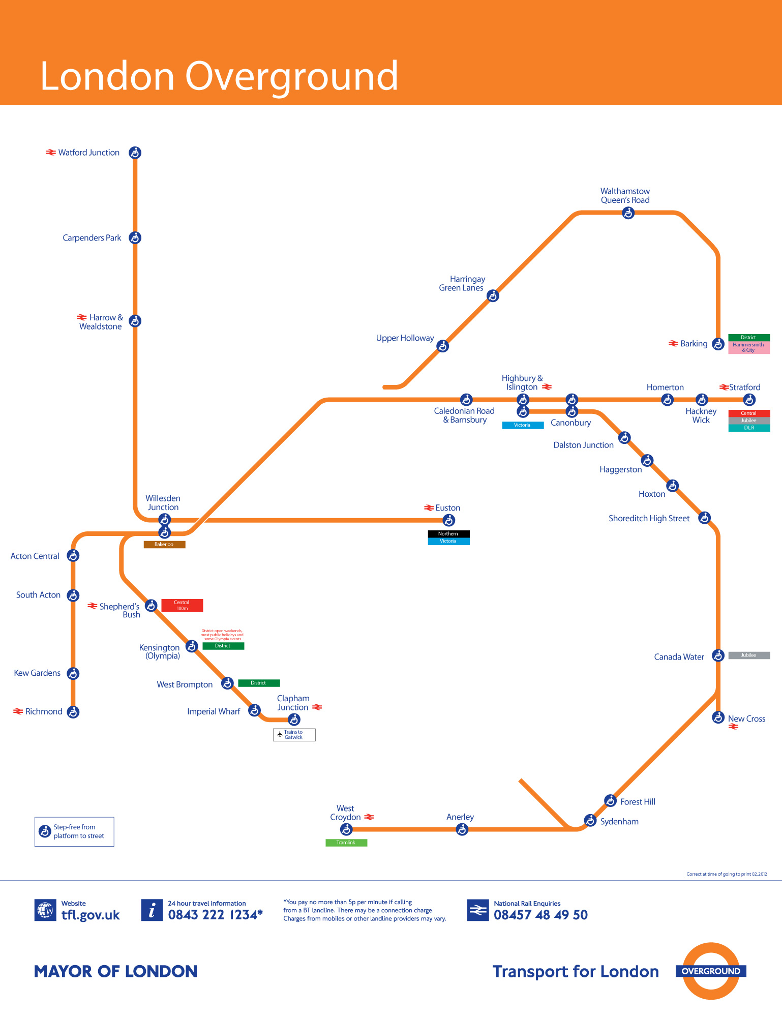
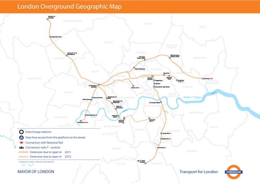
This is the fourth installment of my Accessible Transit Map series. Intended as a replacement map for those with disabilities, this map illustrates which station stops on the Transport for London London Overground system is accessible for those with strollers or with a disability.
London Overground, a suburban rail network in the United Kingdom, is part of the National Rail network linking 20 of London’s 32 boroughs. Starting in 2007 Transport for London consolidated different existing rail concessions and extended new trackage to form the London Overground.
As in previous maps, I have removed all stations which are not handicapped accessible. Maps represent corporeal objects, through convenient fictions – a representation which works for a majority of its users. But where are the maps for the disabled or those require additional accessibility? Wouldn’t the mother with newborn in stroller need a different map then those without the need to lug all the accoutrement’s of childhood? Equally, those in a wheelchair require a map different then one which the walking can use. I decided to rectify the situation by editing the maps of major metropolitan transportation systems, in order to create a map for those who are not represented on the official map.
You can download the London Overground Accessible Transit map below – which comes in two versions – Network and Geographic:
London Overground Accessible Transit Network Map – jpg image, PDF file
London Overground Accessible Transit Geographic Map – jpg image, PDF file
These blobs represent the extent that you’d be able to travel on public transit in 30 minutes. The 20 maps below were made by Mapnificent, a new website created by Stefan Wehrmeyer that suck in Google Maps-friendly transit data to show just how much of the city you can cover in however much time you want to spend. A handy slider allows you to change your allotted time, and your starting point can be anywhere on the map.
Pedestrians on Broadway in this area can stumble upon an Ivy League university or gaze through the windows of Tom’s Restaurant, of “Seinfeld” fame. They can find a copy of “Pride and Prejudice” for $2 at a stand on West 112th Street, and, four blocks south, a taco for 50 cents more. They can even sip mojitos at Havana Central at the West End, near West 114th Street.
But they will never find West End Avenue between Broadway and Riverside Drive.
Mr. Tauranac, who has for years assailed Mr. Vignelli for such inaccuracies as having Bowling Green north of Rector Street, said the revelations had forced him to re-evaluate his harsh judgments of Mr. Vignelli, 81. “It really has dulled my attack, that’s for sure,” Mr. Tauranac said.
Moments later, he retrieved from his office the May 2008 copy of Men’s Vogue, featuring an updated Vignelli map “every bit as terrible a map as he designed in 1972,” to Mr. Tauranac’s eye.
“I’m happy to see that he’s mellowing,” Mr. Vignelli said.
The current map is an abomination of design, the revelation of more mistakes just compounds the existing travesty. Not that Vignell’s 1972 map is any better with oversimplification, a precious use of color and lines rendering it more art piece than functional map or diagram.
It seems every designer is trying to reinvent Harry Beck’s amazing diagram for both the Paris Metro and the London Underground:
The problem being that Beck’s Underground Map is uniquely suited to London’s system, not New York City subway’s combination of express/local lines, geography and history of being composed of three different subway companies.
The nation’s most densely populated urbanized area is Los Angeles-Long Beach-Anaheim, Calif., with nearly 7,000 people per square mile. The San Francisco-Oakland, Calif., area is the second most densely populated at 6,266 people per square mile, followed by San Jose, Calif. (5,820 people per square mile) and Delano, Calif. (5,483 people per square mile). The New York-Newark, N.J., area is fifth, with an overall density of 5,319 people per square mile.
What is interesting to me, is that using the MSA, which we have talked about before (Metropolitan and Micropolitan Statistical Areas), but it is helpful to remember that the OMB defines MSA’s as, “one or more adjacent counties or county equivalents that have at least one urban core area of at least 50,000 population, plus adjacent territory that has a high degree of social and economic integration with the core as measured by commuting ties.” Below is a comparison of the Los Angeles MSA (on the left) with the New York MSA on the right, along with data from the 2010 Census:
Los Angeles and New York City MSA, 2010 Census. Dark poche indicates urbanized area or urban cluster of 10,000 or more
MSA
Population
Area
Density
Los Angeles: LA, Long Beach, Anaheim
12,150,996 people
1,736.02 sq. miles
6,999.3 people per sq. mile
New York: NYC, Newark, Bridgeport
18,351,295 people
3,450.2 sq. miles
5,318.9 people per sq. mile
As you can see, the New York MSA is almost twice as big in land area as the Los Angeles MSA. If we look back up to the definition of a MSA, specifically the part about a high degree of social and economic integration with the core as measured by commuting ties, this makes sense: New York’s subway and commuter rail is magnitudes bigger and more effective than Los Angeles.
There is no doubt that the less dense suburban areas of Connecticut, New Jersey and Long Island bring down the top-line density figure. In this case, the MSA comparison hides more than it reveals: while LA is undoubtable denser than popular notions give it credit for, the more complete transportation system of New York creates a larger livable catchment area.
While there are no studies which confirm that radio frequencies cause the symptoms discussed in the video, if the National Radio Quiet Zone is successful as a giant placebo and people can live their lives, then that is double-plus good.
What exactly is the US National Radio Quiet Zone? Glad you asked:
The astronomers who selected Green Bank as the site for the telescope in the mid-1950s chose carefully. The surrounding Allegheny Mountains provided a natural shield against radio and television broadcasts. Flanked by national forests teeming with black bears and wild turkeys, the area would remain undeveloped in perpetuity. And for all its physical isolation, it was only a day’s drive from many East Coast universities. Even back in the ’50s, though, farsighted scientists feared that radio-frequency emitters would eventually creep into the area. More aggressive protection would be necessary.
Thus, in 1958 the FCC set aside a rectangular-shaped territory the size of Massachusetts and Connecticut combined and called it the National Radio Quiet Zone, to be administrated by the National Radio Astronomy Observatory, a government-funded research facility in Charlottesville, Virginia. The NRAO later built other radio telescopes – in Socorro, New Mexico (the setting for the film Contact with Jodie Foster), and Tucson, Arizona – but it never again had the clout to impose quiet around them. Today, Green Bank is radio astronomy’s crown jewel. Over the years, the telescope has played a key role in understanding the behavior of pulsars, searching for extraterrestrial life, and probing the halo of hydrogen that surrounds the Milky Way galaxy. It’s one of the few facilities on the planet where radio astronomers can make observations at most points along the electromagnetic spectrum.
I think what makes this story interesting (and so evergreen) is both the extra-state nature of this zone, which spans three states, and the nature of the rules which must be followed inside an area of the US which is about as large as Massachusetts and Connecticut combined. Rules governed by the scientists, through the FCC, which virtually forces inhabitants to refrain from using many accouterments of “modern life” – or at the very least creating many workarounds to protect science. Because the rules are chiefly there to do two things: protect the scientific study of the cosmos, and to make electronic eavesdropping by many-acronym agencies possible.


