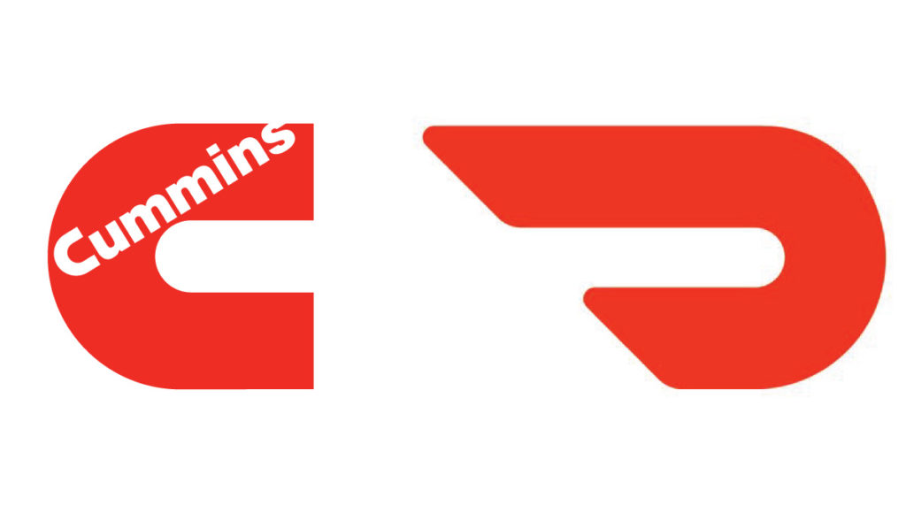
The Door Dash logo (by Character) looks like a reflected Cummins Diesel logo by Paul Rand. Makes me think that they just saw Rand’s logo, flipped it and elongated it.

Another in a series of graphics work which doesn’t make the cut, but shouldn’t be sent to the bit bucket.

The story begins in 2006 with a trip down Route 66. Day in, day out, I looked at U.S. traffic signs that were either set in the old, somewhat clumsy “FHWA font series” or the new Clearview HWY typeface. Approaching the signs, I would often test myself: which typeface works best from a distance, and which of its features or details might be responsible for its performance.
Read more at The design of a signage typeface Wayfinding Sans and see a Flickr collection of World of Traffic Signs and group Type on Traffic Signs.
 Lufthansa Europa Jet, originally uploaded by alphanumeric.