Tube Map Variations & Homages

Harry Beck’s London Underground map is a seminal piece of design, rightly considered the map which all transport diagrams are held to. Recently the Tube Map has become the go-to diagram to remix and reinterpret a whole host of information, with Simon Patterson’s The Great Bear in 1992 kicking off a flurry of remixes shown below.

Where possible, I have included high-resolution versions as an archive. Please note: these are not the actual Tube maps which are available on the Transport for London maps page and they are not reinterpretations of the actual Tube map.

The Great Bear – Simon Patterson, 1992

The Great Bear – Simon Patterson, 1992

Tube Music – Dorian Lynskey, 2006

Tube Music – Dorian Lynskey, 2006

Royal Shakespeare Company – Kit Grover & Hester Lees-Jeffries 2007

Royal Shakespeare Company – Kit Grover & Hester Lees-Jeffries 2007
(All change at Lady Macbeth)

Underground Film Map – Film London and the BFI London Film Festival

Underground Film Map


The Underground Film Map is for sale from TfL.


Census Dotmap

Population Dots

Census Dotmap is a map of every person counted by the 2010 US and 2011 Canadian censuses. The map has 341,817,095 dots – one for each person – generated by a Python script from US Census block-level counts, and then generated the tiles with Processing. Here’s more detail for the interested.

Visualizing The Racial Divide

Visualizing The Racial Divide – Columbus, OH by Jim Vallandingham

Visualizing The Racial Divide by Jim Vallandingham:

Each city is made up of tracts from the 2010 Census. Census tracts are pushed away from neighboring tracts based on the change in proportion of white and black populations between each neighboring tract.

Tracts that have a similar racial mix as their neighbors form groups. Spaces occur where there is a significant change in the racial makeup between neighboring tracts. The space is proportional to the change in racial composition between neighbors (Read More).

Accessible Transit: Paris Metro

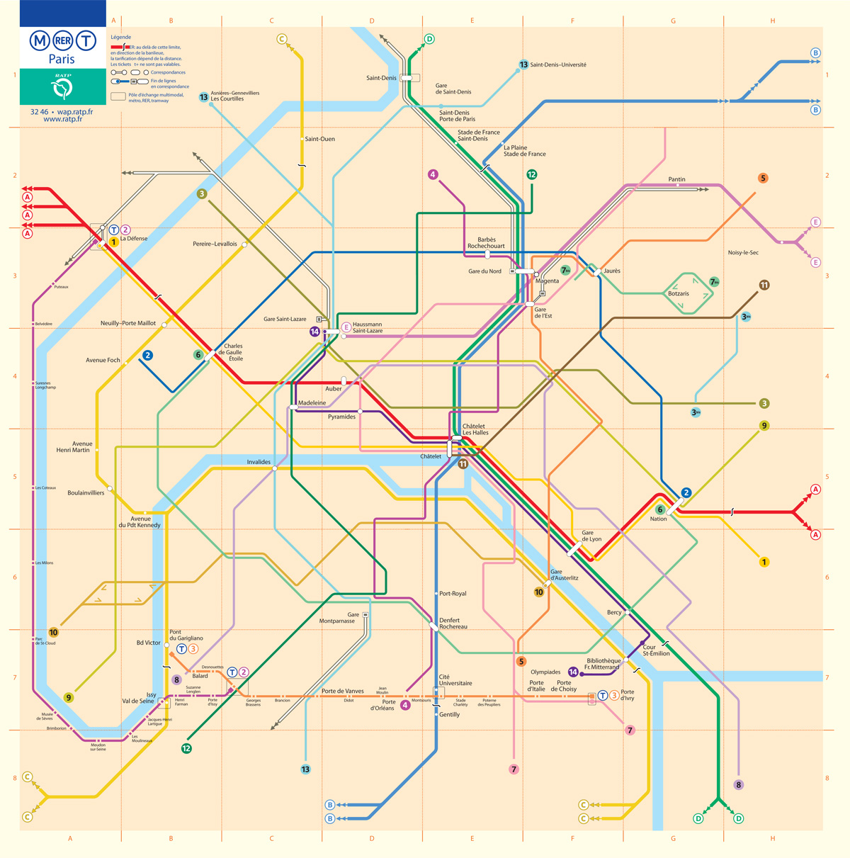
This is the fifth installment of my Accessible Transit Map series. Intended as a replacement map for those with disabilities, this map illustrates which station stops on the Paris Metro are accessible for those with strollers or with a disability. As you can see below, very few stations are accesible in the City of Light:

Opened in 1900, network’s sixteen lines are mostly underground and run to 214 km (133 mi) in length with 301 stations, of which 62 are interchange stations. Just 50 Metro/RER stations within central Paris have elevators and are accessible for wheelchairs or for strollers. Just like London’s Underground the Metro was largely built when accessibility wasn’t a concern; unfortunately the RATP doesn’t match Transport for London’s excellent Accessibility guidelines, offering only a page of platitudes:

Accessibility for persons with reduced mobility. It is the RATP’s ambition to provide every traveller with a transport system suited to his needs from end to end.

As in previous maps, I have removed all stations which are not handicapped accessible. Maps represent corporeal objects, through convenient fictions – a representation which works for a majority of its users. But where are the maps for the disabled or those require additional accessibility? Wouldn’t the mother with newborn in stroller need a different map then those without the need to lug all the accoutrement’s of childhood? Equally, those in a wheelchair require a map different then one which the walking can use. I decided to rectify the situation by editing the maps of major metropolitan transportation systems, in order to create a map for those who are not represented on the official map.

You may download the Accessible Transit Paris Metro map here:

Other Accessible Transit Maps for your perusal: