The mean center of U.S. population is determined by the United States Census Bureau after tabulating the results of each census. The Bureau defines it to be:
…the point at which an imaginary, flat, weightless, and rigid map of the United States would balance perfectly if weights of identical value were placed on it so that each weight represented the location of one person on the date of the census.
During the 20th century, the mean center of population has shifted 324 miles west and 101 miles south. The southerly movement was much stronger during the second half of the century; 79 miles of the 101 miles happened between 1950 and 2000.
Month: January 2009
2009-01-26

The A to Z of Designers
 The A to Z of Designers, originally uploaded by shaundesign1
Buy this and keep the economy alive: Shaun Design.
Thursday, Oscars Were Announced, Links
OpenStreetMap Time Lapse
http://vimeo.com/moogaloop.swf?clip_id=2598878&server=vimeo.com&show_title=1&show_byline=1&show_portrait=0&color=&fullscreen=1
OSM 2008: A Year of Edits from ItoWorld on Vimeo.
Via Ben Fry come this video shoing a time-lapse of all the edits for the OpenStreetMap project for 2008.
OpenStreetMap is a wiki-style map of the world and this animation displays a white flash each time a way is entered or updated. Some edits are a result of a physical local survey by a contributor with a GPS unit and taking notes, other edits are done remotely using aerial photography or out-of-copyright maps, and some are bulk imports of official data.
2009-01-22

Eisenman Obamicon

I couldn’t resist making this after discussing Derrida Estate Kickbacks. Yes… I am reading too much Post Structural theory at the moment.
Make your own Obamicon.
Accessible Transit Massimo Vignelli NYC Subway Map Edition
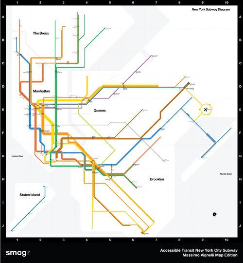
This is the third installment of my Accessible Transit Map series. Intended as a replacement map for those with disabilities, this map illustrates which station stops on the New York City Transit Authority’s system is accessible for those with strollers or with a disability.
This map is special: it is the updated system map by Massimo Vignelli, a design which is beautiful but which I have been a vocal critic of. For those who don’t know about Vignell’s 1972 map, read Michael Bierut’s history, Mr. Vignelli’s Map which is very well written.
As in previous maps, I have removed all stations which are not handicapped accessible. Maps represent corporeal objects, through convenient fictions; a representation which works for a majority of its users. But where are the maps for the disabled or those require additional accessibility? Wouldn’t the mother with newborn in stroller need a different map then those without the need to lug all the accoutrement’s of childhood? Equally, those in a wheelchair require a map different then one which the walking can use. I decided to rectify the situation by editing the maps of major metropolitan transportation systems, in order to create a map for those who are not represented on the official map.
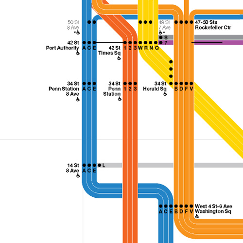
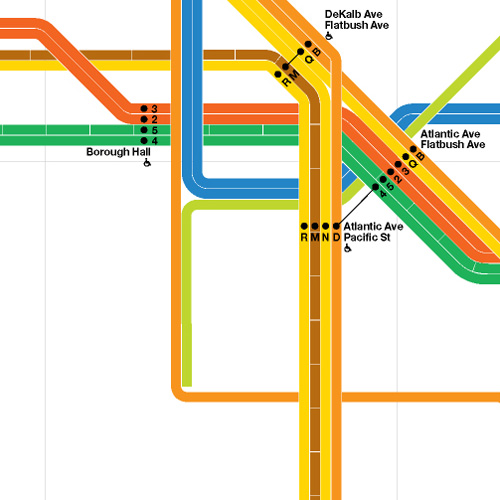
Here are details of the map:
Midtown Detail
Brooklyn Detail
Coney Island Detail

From the three details shown above the system map gradually becomes more beautiful as you strip information away; as more and more stations are removed, the system becomes more diagrammatic and pure. This is the issue I have with Vignelli’s original, and update map: the subway is not an abstract diagram, no matter that the designer wishes it to be. No matter that Vignelli has created a masterpiece of design, the system will never be forced into the visual language that London’s Underground uses so successfully. As so it will be: the historical traces of over one hundred years of service, created by three different companies, will continue to bleed through time into today’s maps.
Feel free to download the map in pdf format: Accessible Transit Massimo Vignelli NYC Subway Map Edition.
Other Accessible Transit Maps for your perusal:
Please see also:
- United Nations expands Australia’s territory
- London Underground Map formatted for iPhone
- Comparing NYC & Washington DC – Area, Population, Density & Average Income
- Getting Real: Reflecting on the New Look of National Park Service Maps
- Radical Cartography: Building Heights as indirect measure of land value
- The 51st State – State of New York City
- Interstate Infrastructure
Day After Change, Links
- Obama signs temporarily replace Bush signs
- Illinois Legislature Puts a Price on Carbon – at $400 per ton
- Biology lecture “gig posters”
- Satellite image of inauguration
- The anti-dust fountains of Owens Lake, California: “rising like alien plants on the terraformed lakebed”
- Statistics, Science, and Speeches
- Posh to be Poor?
- Visualization: Residents per IKEA
- THE NEW GOTHAMS: 46 New Fonts from H&FJ
- Recycled Paper Sculptural Installations by Susan Benarcik
- Tradition and Change Battle on the Mall
- The Train in Spain Replaces the Plane
- Deconstructing Gaza
- Syllabus: Network Culture at Penn
- Czech artist tells European Union to lighten up
- Social Software Microprinter
Neue Haas Grotesk Specimen Book
 Neue Haas Grotesk Satzklebebuch, originally uploaded by rallovallo
See full Neue Haas Grotesk Specimen Book set (via) which was the original name for Helvetica.