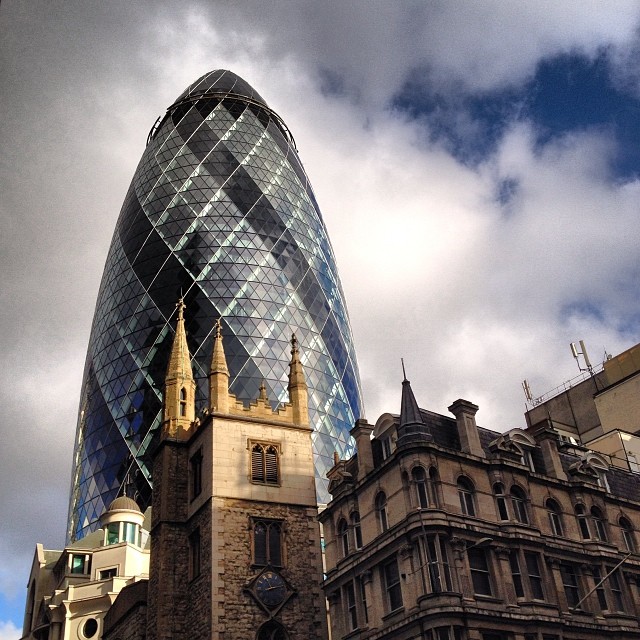
Tag: London
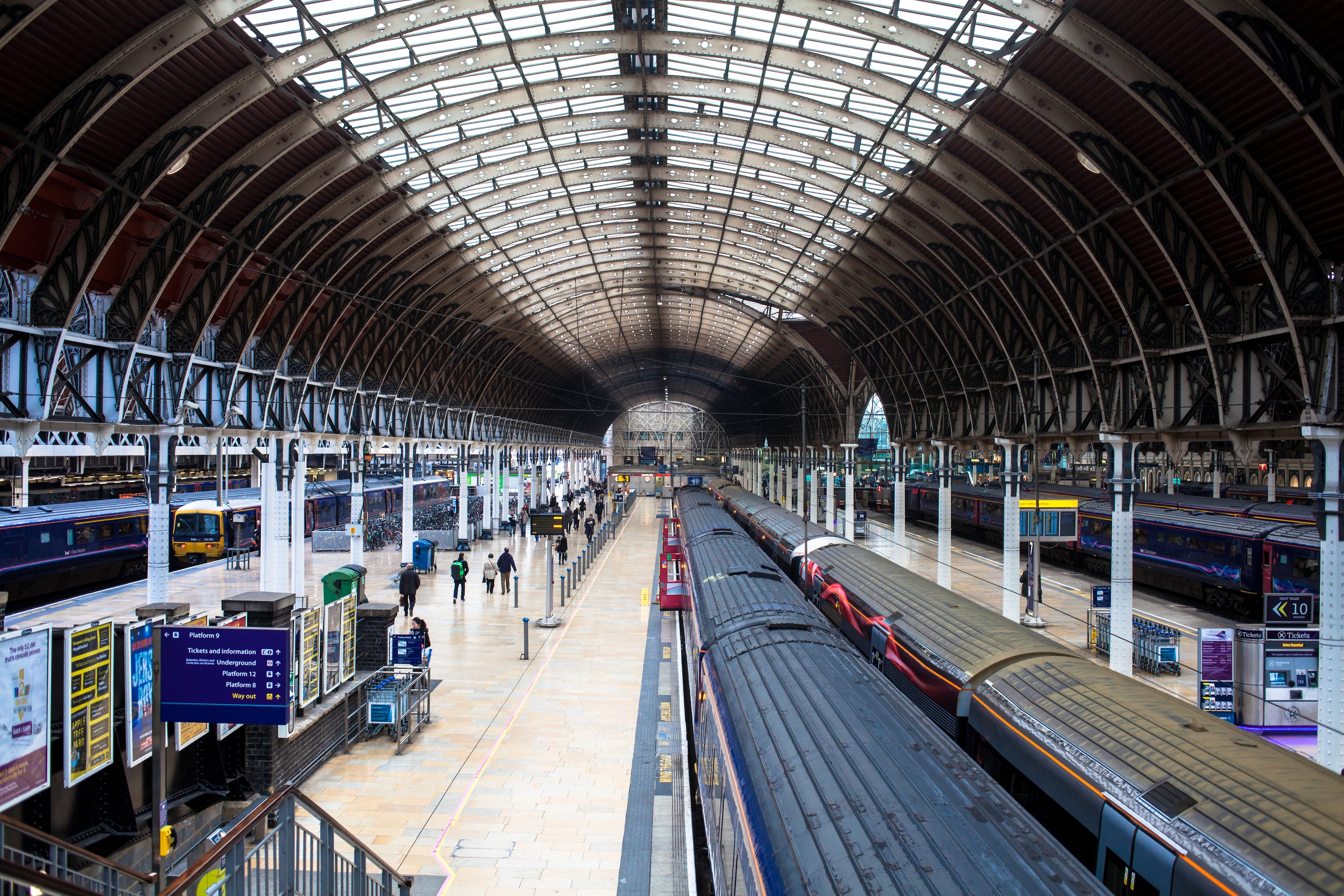
Paddington Station
London Evolution Animation
Tube Map Variations & Homages
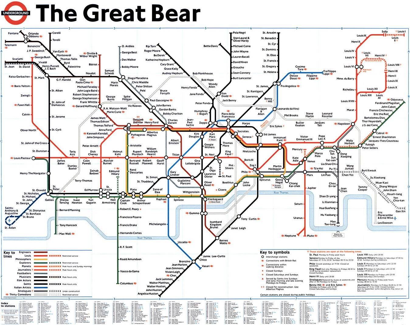
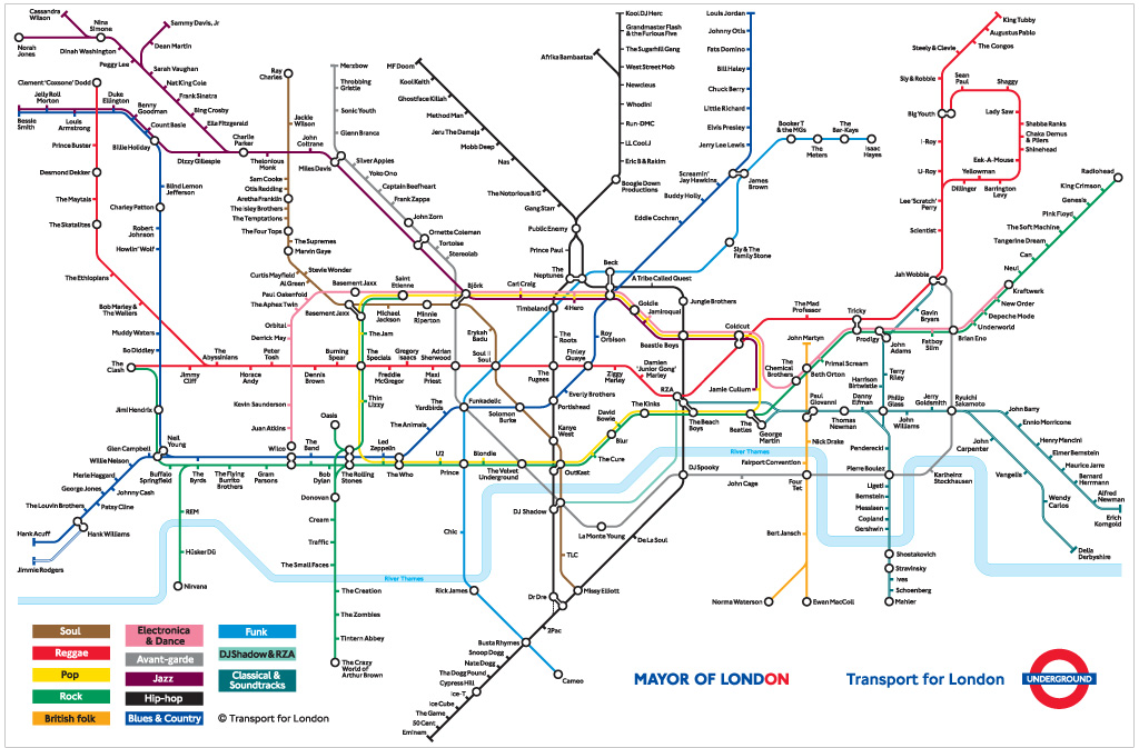
Harry Beck’s London Underground map is a seminal piece of design, rightly considered the map which all transport diagrams are held to. Recently the Tube Map has become the go-to diagram to remix and reinterpret a whole host of information, with Simon Patterson’s The Great Bear in 1992 kicking off a flurry of remixes shown below.
Where possible, I have included high-resolution versions as an archive. Please note: these are not the actual Tube maps which are available on the Transport for London maps page and they are not reinterpretations of the actual Tube map.
The Great Bear – Simon Patterson, 1992
Tube Music – Dorian Lynskey, 2006
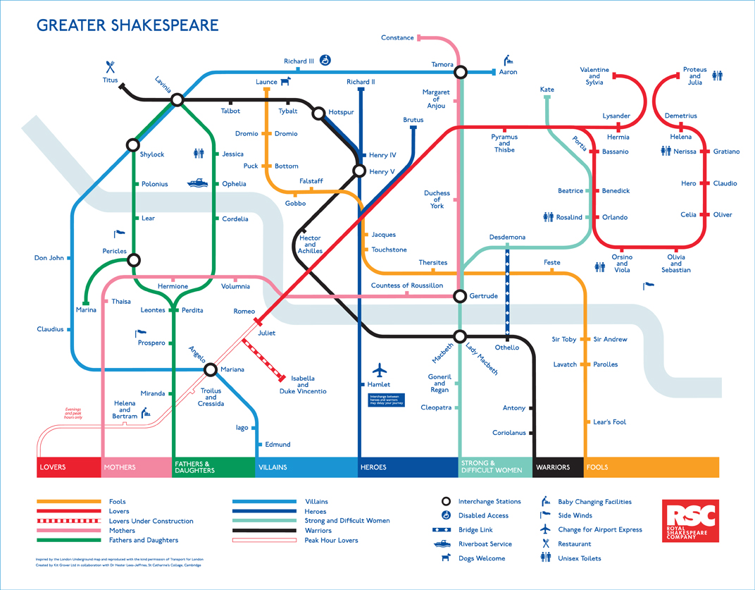
Royal Shakespeare Company – Kit Grover & Hester Lees-Jeffries 2007
Underground Film Map – Film London and the BFI London Film Festival
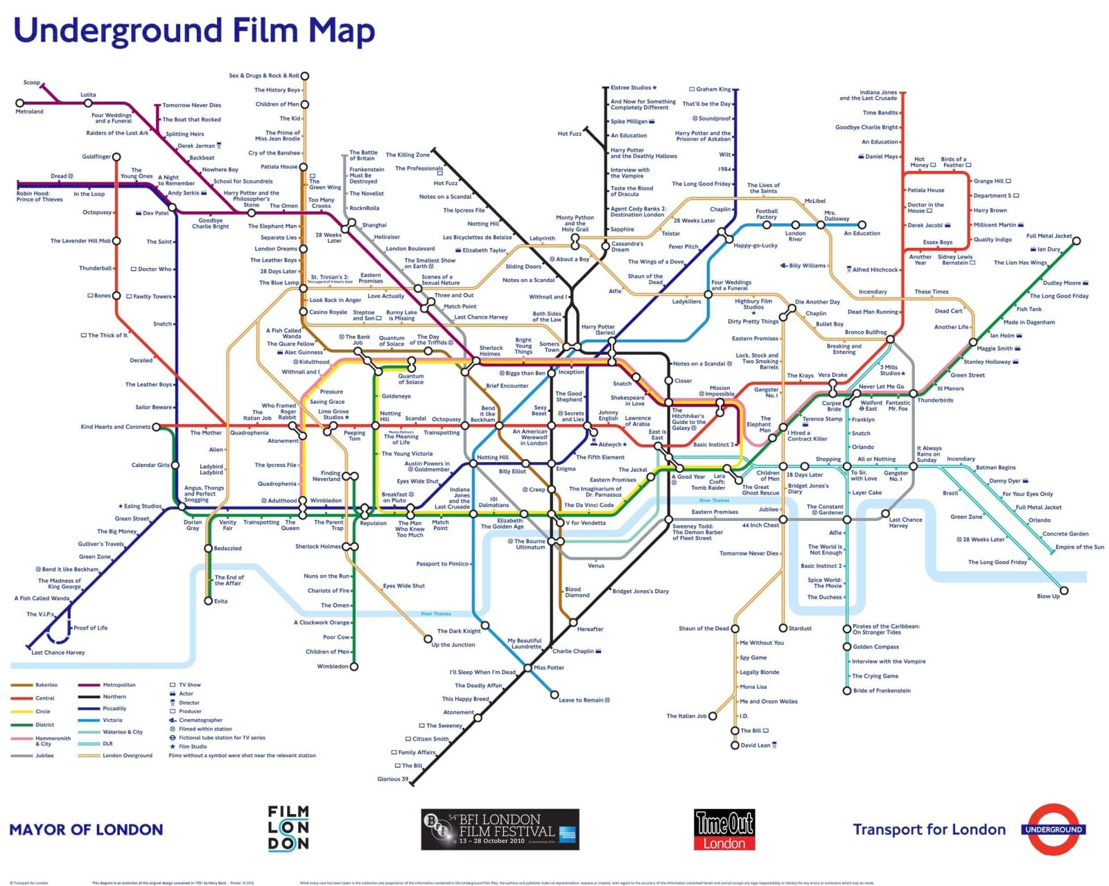
The Underground Film Map is for sale from TfL.
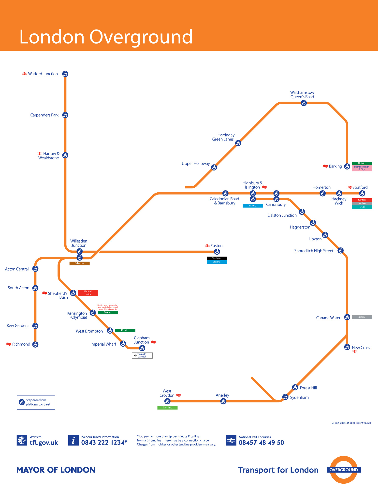
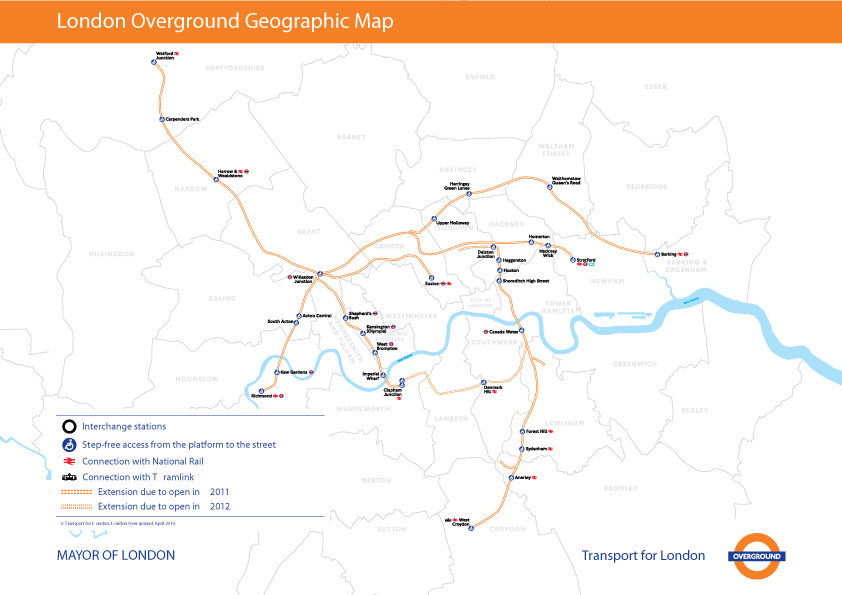
Accessible Transit: London Overground
![]()
This is the fourth installment of my Accessible Transit Map series. Intended as a replacement map for those with disabilities, this map illustrates which station stops on the Transport for London London Overground system is accessible for those with strollers or with a disability.
London Overground, a suburban rail network in the United Kingdom, is part of the National Rail network linking 20 of London’s 32 boroughs. Starting in 2007 Transport for London consolidated different existing rail concessions and extended new trackage to form the London Overground.
As in previous maps, I have removed all stations which are not handicapped accessible. Maps represent corporeal objects, through convenient fictions – a representation which works for a majority of its users. But where are the maps for the disabled or those require additional accessibility? Wouldn’t the mother with newborn in stroller need a different map then those without the need to lug all the accoutrement’s of childhood? Equally, those in a wheelchair require a map different then one which the walking can use. I decided to rectify the situation by editing the maps of major metropolitan transportation systems, in order to create a map for those who are not represented on the official map.
![]()

![]()
![]()
You can download the London Overground Accessible Transit map below – which comes in two versions – Network and Geographic:
- London Overground Accessible Transit Network Map – jpg image, PDF file
- London Overground Accessible Transit Geographic Map – jpg image, PDF file
Other Accessible Transit Maps for your perusal:
The Tube – BBC Two

The Tube is a BBC Two television documentary which looks into the life of those who work and travel on London Underground. It premiered in February, but is just coming to India and is well worth watching to see behind-the-scenes footage of both the infrastructure but also the people who make the Tube go.
Please also see:
London Low Emission Zone
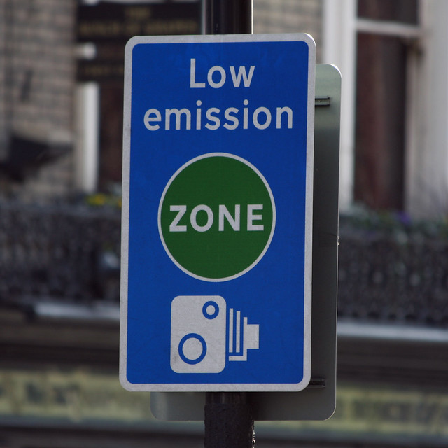
News to me: besides having a Congestion Charge zone, London also has a Low Emission Zone
The Low Emission Zone (LEZ) was introduced in 2008 to encourage the most polluting heavy diesel vehicles driving in the Capital to become cleaner. The LEZ covers most of Greater London. To drive within it without paying a daily charge these vehicles must meet certain emissions standards that limit the amount of particulate matter (a type of pollution) coming from their exhausts.
The low emission zone started operating on 4 February 2008 with phased introduction of an increasingly stricter regime until 3 January 2012, and as shown below, covers pretty much all of metropolitan London (the congestion charge zone is shaded orange).

The LEZ is monitored using Automatic Number Plate Reading Cameras to record number plates checking vehicles against the records of the Driver and Vehicle Licensing Agency to enable Transport for London to pursue owners of vehicles for which the charge has not been paid.
It would come as little surprise to my reader that I am a proponent of the London Low Emission Zone; much like the congestion zone, the low emission zone prices (ever so bluntly) an externality: particulate matter which is being dumped into the air by commercial vehicles. A charge both prices in this externality and will drive innovation to reduce vehicle emissions.
I also love the graphic sensibility of the advertising and communication on their website and in collateral, examples shown below.


Olympics Brand Exclusion Zone

In urban design, exclusion zones are becoming commonplace in relation to sponsorship of sporting events. The Brand Exclusion Zone is the newest form of urban demarcation, and can be used not only to affect signage and advertising, but also restrict personal freedom of choice. Within this context, the London 2012 Olympics represents one of the most radical restructuring of the rights of the city in London. The ‘canvas’ of London will belong exclusively to the Olympic marquee brands.
In essence, London has abdicated all rights and responsibilities to the International Olympic Committee, and implemented legislation which creates radical new spatial demarcations not only within the Olympic Park, but because of the distributed nature of the Olympic venues, across the whole of central London. London has surrendered the traditional rights to the city to the demands of the Olympic ‘family’ and their corporate paymasters. What the IOC want, London will give. London will be on brand lockdown.
This is horrible: there really isn’t more to say about the continual erosion of the public sphere to private commerce. The Olympics has, and continue to be an excuse to market products with a thin veneer of athletic competition as an afterthought.
Also note the O2 Arena, shown above, will be called the North Greenwich Arena. Something I’m sure O2 is thrilled about.
British Design Classics stamps by Royal Mail

How did I miss this? In 2009 the UK Royal Mail issued a set of eight British Design Classics stamps featuring excellent photography by Jason Tozer. I wouldn’t mind having these set of stampe, or really all ten of these items in my possession.


On New York Subway Map’s Compounding Travesty
Pedestrians on Broadway in this area can stumble upon an Ivy League university or gaze through the windows of Tom’s Restaurant, of “Seinfeld” fame. They can find a copy of “Pride and Prejudice” for $2 at a stand on West 112th Street, and, four blocks south, a taco for 50 cents more. They can even sip mojitos at Havana Central at the West End, near West 114th Street.
But they will never find West End Avenue between Broadway and Riverside Drive.
Mr. Tauranac, who has for years assailed Mr. Vignelli for such inaccuracies as having Bowling Green north of Rector Street, said the revelations had forced him to re-evaluate his harsh judgments of Mr. Vignelli, 81. “It really has dulled my attack, that’s for sure,” Mr. Tauranac said.
Moments later, he retrieved from his office the May 2008 copy of Men’s Vogue, featuring an updated Vignelli map “every bit as terrible a map as he designed in 1972,” to Mr. Tauranac’s eye.
“I’m happy to see that he’s mellowing,” Mr. Vignelli said.
via On New York Subway Map, a Wayward Broadway and Phantom Blocks – NYTimes.com.
The current map is an abomination of design, the revelation of more mistakes just compounds the existing travesty. Not that Vignell’s 1972 map is any better with oversimplification, a precious use of color and lines rendering it more art piece than functional map or diagram.
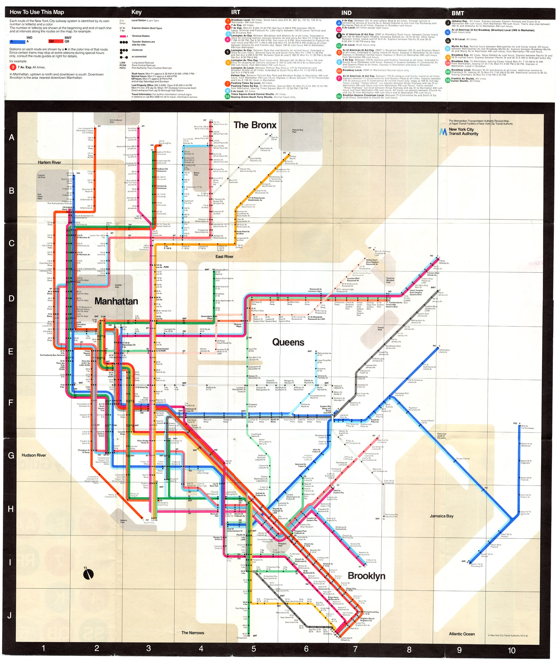
It seems every designer is trying to reinvent Harry Beck’s amazing diagram for both the Paris Metro and the London Underground:


The problem being that Beck’s Underground Map is uniquely suited to London’s system, not New York City subway’s combination of express/local lines, geography and history of being composed of three different subway companies.
See also